PPC Reports are essential if you offer paid advertising as a service. However, they can be time-consuming to construct and difficult to manage, primarily when your reports cover advertising on multiple platforms, such as Facebook Ads, Google Ads, and Bing Ads.
It would be a huge headache for everyone to manually combine all the data into a report that no one wants. But now, you no longer have to spend hours manually hand-stitching your PPC reports, thanks to Google Data Studio (GDS).
Just connect your GDS with third-party data connectors, and VOILA! A perfect PPC report is ready to be served!
If you are new to the world of reporting, you can also learn about Google Data Studio Here.
What is Google Data Studio?
GDS, a.k.a Google Data Studio, is a terrific, free data visualization tool that allows you to create interactive dashboards as well as personalized, accurate, and visually appealing reporting documents.
Fun Fact: Fun Fact: Google Data Studio can analyze raw data from more than 800 data sets across 490+ data connectors.
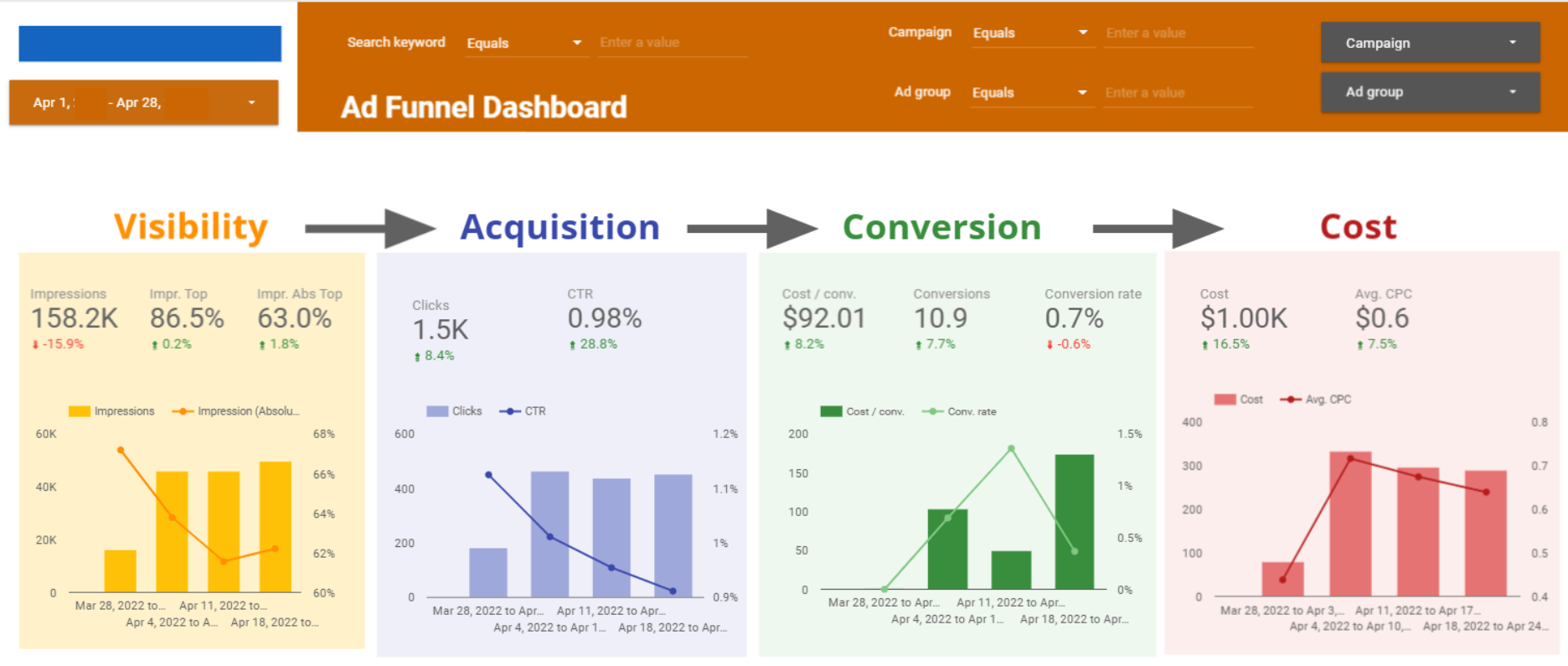
What is a PPC dashboard?

Data from all of your pay-per-click campaigns are shown in real-time on a PPC dashboard. From integrations such as Google Ads, Facebook Ads, Microsoft Ads, Instagram Ads, and others, data is automatically gathered to provide your agency and your clients with a centralized place to track the effectiveness of each campaign separately.
Why does your agency need a Dashboard?
There’s a good chance you manage PPC campaigns for clients across various platforms. As a result, it can be very challenging to keep track of everything that is happening. You don’t want to overlook any data that could add to the overall picture when judging the effectiveness of your campaign.
A scalable PPC dashboard, like Google Data Studio, prepares your agency for success. It consolidates all of your clients’ PPC campaign results in one location and automatically refreshes all of their real-time analytics.
This not only simplifies client reporting but also makes data analysis easier because all your data is displayed together in an easy-to-understand manner, allowing you to compare expenses, click-through rates, conversion rates, and whatnot.
Still, need more convincing? Then read our blog on 7 Reasons to Switch to Google Data Studio!
5 must-have features for Google Data Studio PPC Dashboard

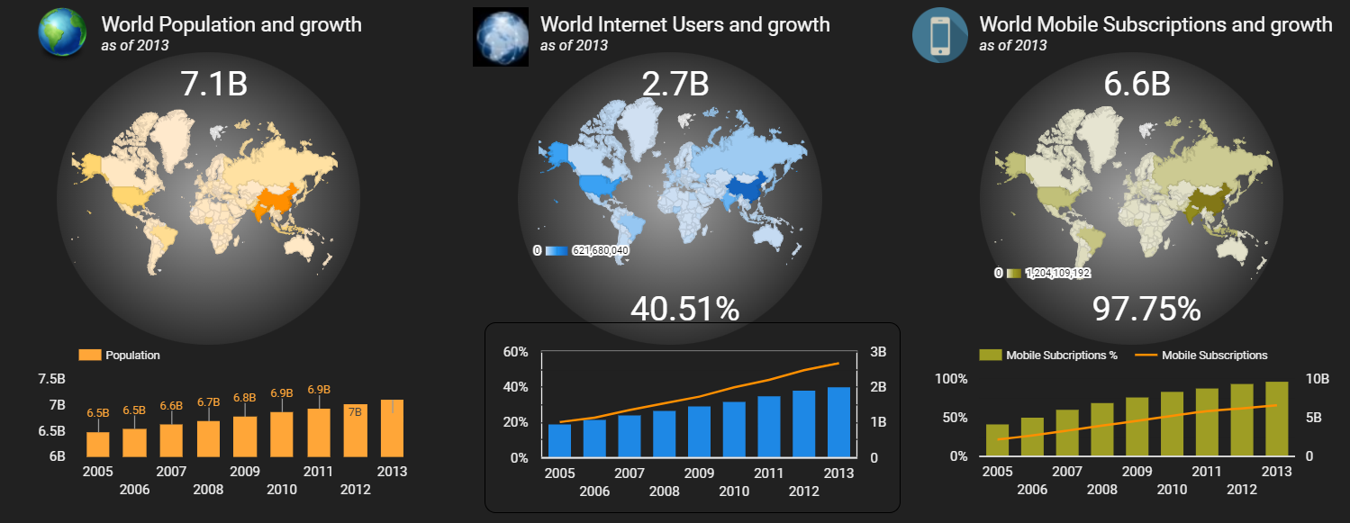
1. Headings, subtitles, and context
In Google Data Studio, when you build a chart, you choose the data source, dimensions, metrics, and date range from the Data Panel to create your visualization.
However, your reader can not see the Data Panel and will not understand what your chart is about unless you include it in your dashboard to adequately explain what your data represents.
As you can see, the data visualizations in the two graphs below images are the same. While image 1 has written titles and context, image 2 merely shows the chart. And you yourself can tell the difference.
2. KPI scorecards
Well, it is pretty obvious that your dashboard needs to include your key performance metrics, But the trick is to pay close attention to where to put them as you’re designing your dashboard.
Your KPIs should take center stage in your report since they matter most. And it makes the process much more smooth in understanding the data.
Tables make it difficult to identify KPIs and hard to follow the required information, such as KPI status.
To get the most out of your reports and dashboards, keep your reader’s attention on your key growth indicators, such as lead volume, revenue, or return on ad spend (ROAS), rather than vanity and traffic metrics like impressions and clicks.
3. Historical comparisons and trends
Using trends and historical comparisons, you can show your audience whether or not things have improved over time.
Perhaps you fell short of the target, or maybe you met your target, but you’re down from last year and need to make some changes.
Using trends and historical comparisons keeps your reader from guessing whether the current performance is average, declining, or the “greatest month ever.” Transparency is the key to real growth.
4. Analytical tables
Tables aren’t exactly glamorous. However, something is likely lacking if your Data Studio Dashboard doesn’t have a table.
Why? Because there can be instances in which your audience wants to compare various metrics across various categories, and nothing accomplishes that task more effectively than a table.
You can use tables to compare common categories like campaigns, conversions, cost, ad groups, keywords, etc. The list is endless and it depends on how extensive your PPC dashboard is.
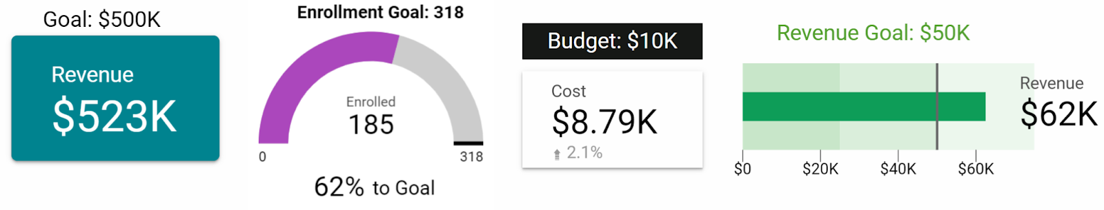
5. Goal Tracking
Some businesses have set monthly or annual marketing budgets that cannot be increased, while others have flexible budgets. Whatever the strategy, your dashboard should provide an answer to the question: Are we accomplishing our goals? If not, then why?
Fortunately, Data Studio has a plethora of options for adding goal tracking, ranging from charting to a written explanation of the target.
Here are some examples of how you can use GDS to correlate performance to a specific goal: