If you were to choose between an aesthetically pleasing website or one that can be pretty basic but has an excellent user interface and gives you more Conversions, which one would you choose?
Well, your answer should always be option no. 2 Because if people buy, it means they like it, and if they like it, then it means your landing page is doing its job pretty well. And it will always help you scale your business more securely and predictably.
And the reason behind it is that many people fall into the trap of producing aesthetically perfect designs but forget that the idea behind a good landing page is conversion, not just design. And it is a common mistake that most make is that they forget that their ideal customer avatar is vastly different from what they might anticipate.
What is a Landing Page?

In most straightforward words, a landing page is a single webpage with one specific objective, usually to drive conversions. Unlike your homepage, which might showcase all your company’s services, a landing page pushes users to do one particular action.
An efficient landing page is often considered the cornerstone of successful digital marketing. Your offer may be fantastic, or your PPC advertisements may be flawless, but your business will suffer if you don’t have a good landing page.
We’ve compiled a list of some tips for creating a perfect landing page so you can see and learn from these and become pros at this business.
What Makes a High-Converting Landing Page?
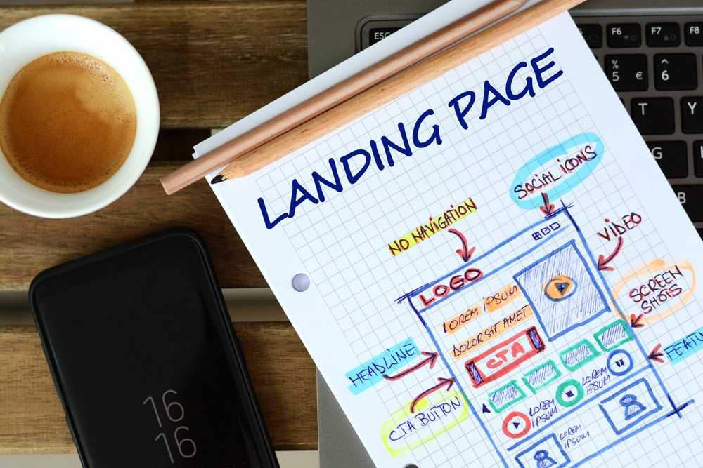
So, let’s start with some main ingredients for a perfect landing page recipe.
Tip #1: Focus on Clean, Organized Design
What Makes a High-Converting
The general appearance, feel, and structure of your page design will significantly impact the success of your landing page and how effectively it drives conversions.
The main objective of your landing page should be to make it as simple as possible for a visitor to convert, so it is essential that all components of your page work towards the conversion goal.
You can use color and eye-catching graphics wisely to design an effective landing page. To find the most effective landing page layout, you can also test several button attributes, such as color, placement, and size.
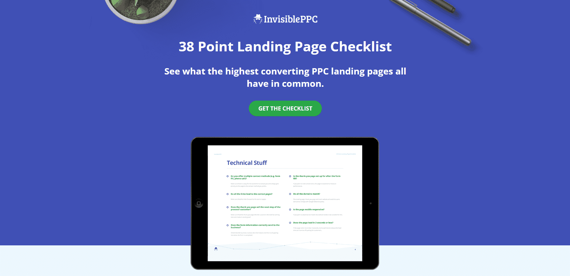
Here is an amazing 38 point landing page checklist that you must try out while building yours
Tip #2: Keep it Focused & Direct
Maintain a clean page with clear, easy navigation and no distractions. A good landing page includes just the right amount of information needed to get visitors to convert. Too much information might be overwhelming for visitors, so keep it simple and easy to use.
The information you put in the forefront should be easily scannable. Smart landing page copy can include bullet points to illustrate details easily.
You should assess what information should be displayed above the fold and in the visitors’ direct line of sight and what can be placed below the fold*.
*The Fold: Above The Fold (or ATF) in layman’s words, the area of a Web page that is visible without scrolling.
Tip #3: Make CTA your friend
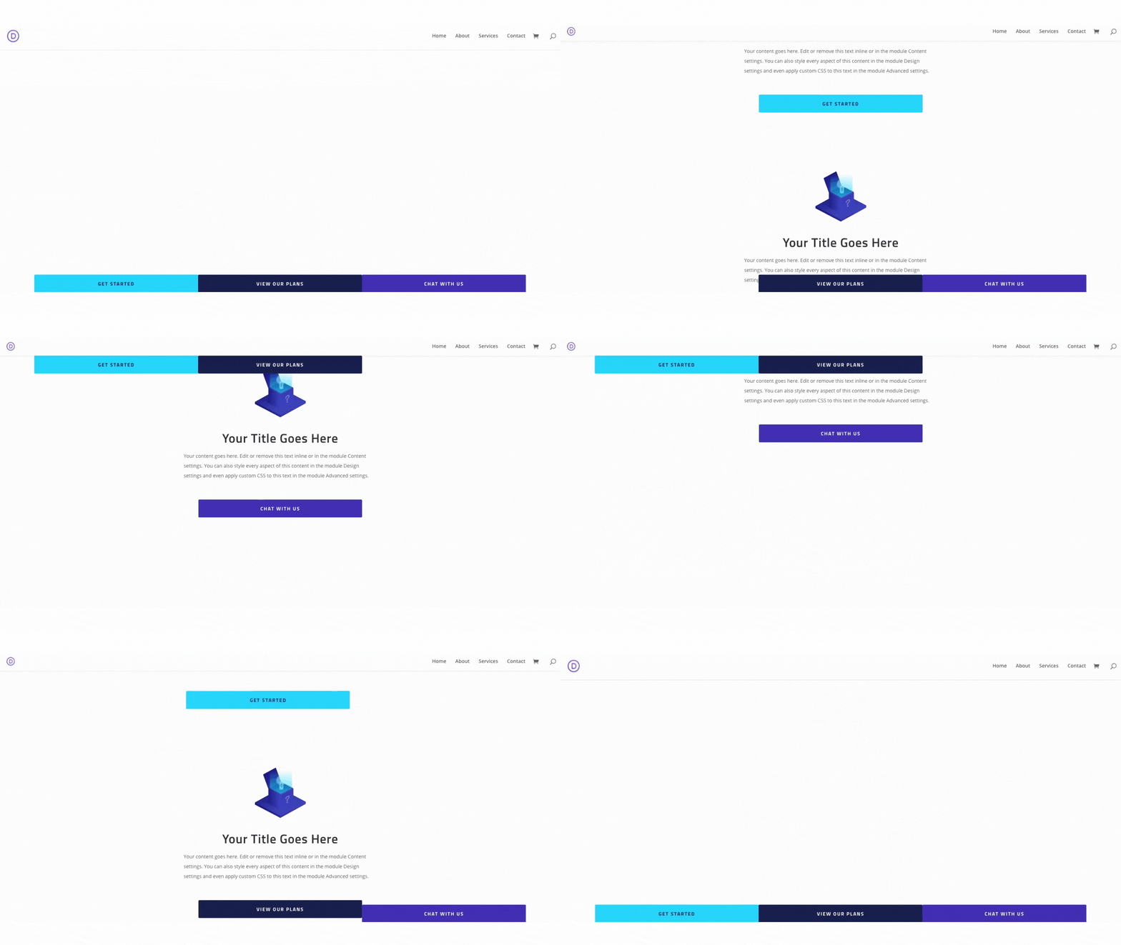
Your significant conversion indicator is your call to action (CTA), which is the one thing you want visitors to do on your website. Make sure your CTA is both visible from a design standpoint and is appealing & catchy enough from a copy perspective.
This is where “Sticky CTA” can play a huge role in conversion. Sticky CTA is like the cousin of Pop-ups who just got better at convincing everyone else. 😛
Remove any secondary links, including site navigation that may cause someone to leave your page before converting through your CTA.
Tip #4: Social proof is your power
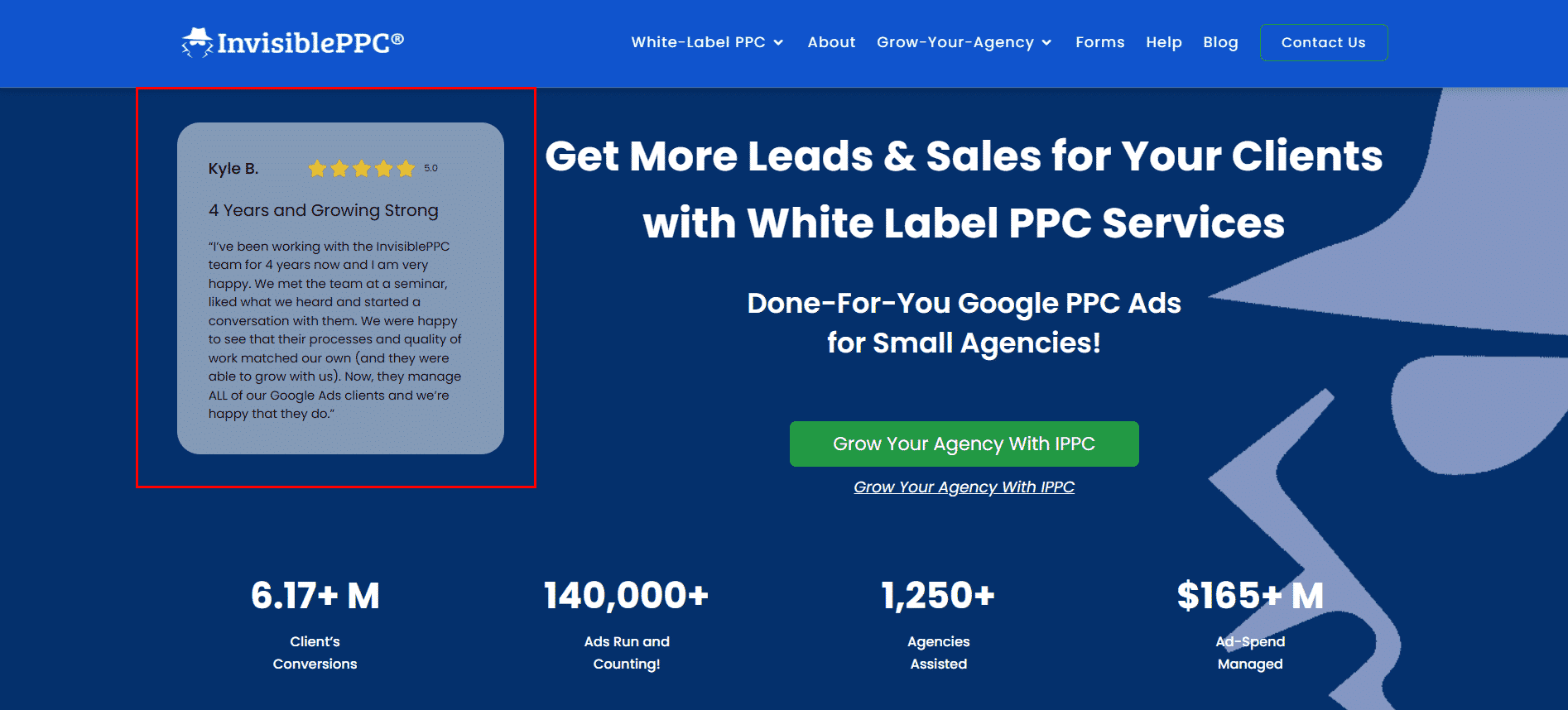
People are significantly more likely to convert on your landing page if they feel that others had done so before you and were satisfied with the results.
This is why social proof like testimonials, reviews, and partner logos can be a great way to help you establish credibility with your prospects rapidly and effectively.
There are 6 kinds of social proof that can be found almost anywhere. You can select one kind for your baseline variant or explore a mix bag option. Choosing the type based on your specific industry and goals is always a good option.
6 kinds of social proof are:
1. Case Studies
2. Customer Feedback

3. Reviews
4. Social Media
5. Icons Of Trust
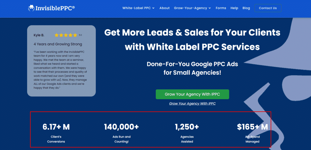
6. Numbers And Data
Tip #5: Make Your Page Mobile Friendly
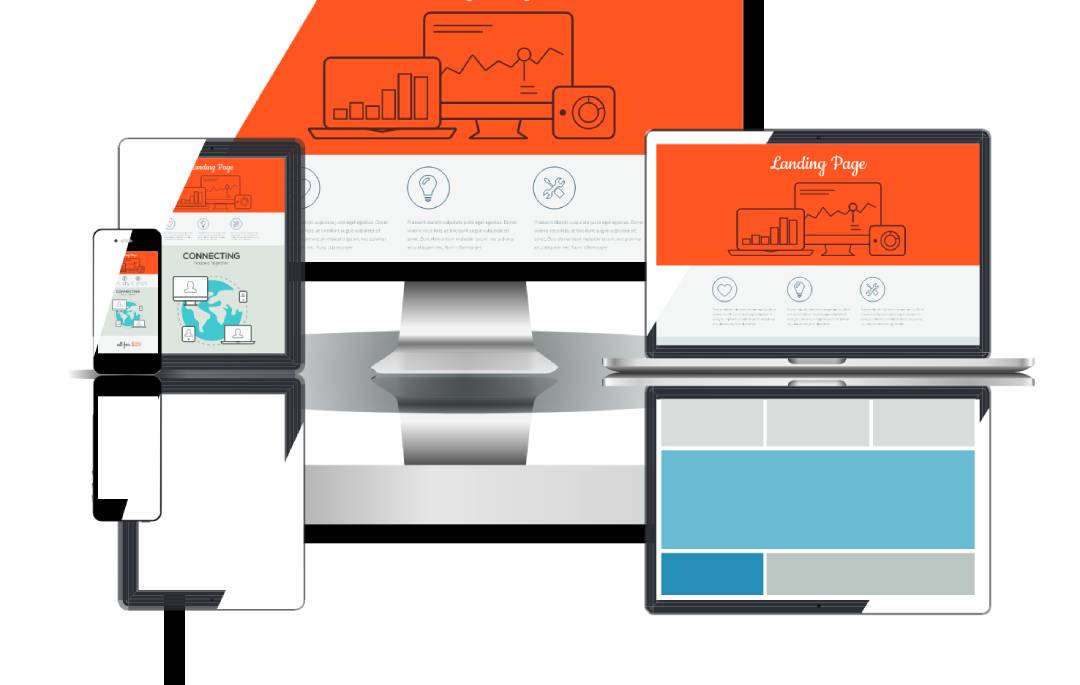
Recent research suggests that nearly 68% of all web activity comes from mobile devices. And with growing mobile users is now essential that your landing page be easily accessible across mobile devices.
It has been found that having a mobile-friendly site can even double your conversions. which is why your landing page should be easy to navigate, has a fast loading speed, and is highly captivating on mobile devices, just as it would be on a desktop.
Tip #6: Keep copy short & meaningful
A Microsoft study discovered that the average human attention span is barely 8 seconds. So now, your primary goal should be to explain how your brand or service would benefit users in the most basic yet captivating language.
Then, if you like, you can go into further detail below the fold. Focus on concise messaging in your headline and description. It’s easier said than done, but it’s crucial for the overall user experience.
You should definitely try the “5-second test” on your landing pages to get the best out of it. 5-second tests are a kind of user research that allows you to measure what information consumers take away and what impression they form after viewing a design for the first 5 seconds.
They are frequently used to evaluate if web pages effectively communicate their overall meaning.
If you can’t do it in 5 seconds, then probably it’s time to change something!
Tip #7: Keep Your Forms Precise
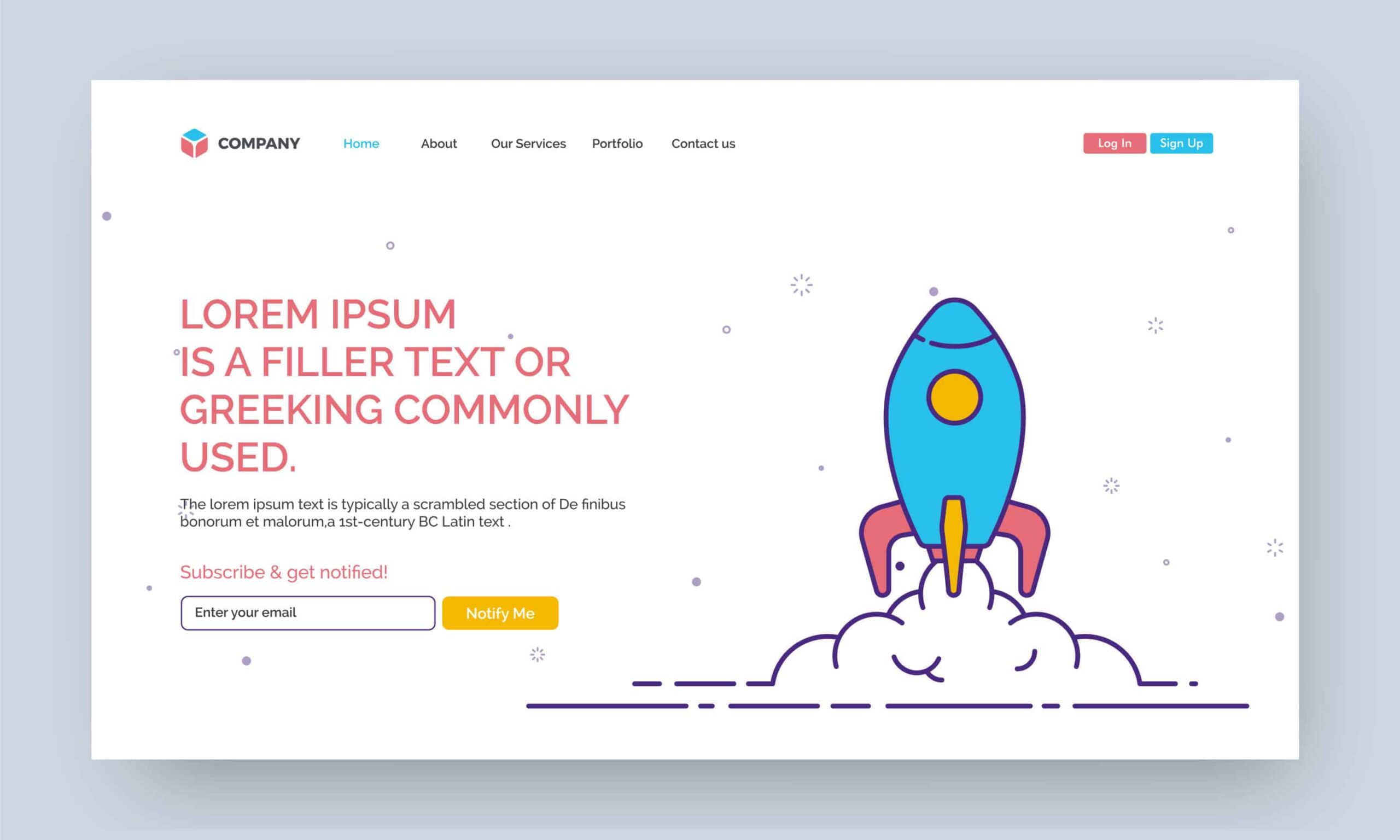
We know whenever a customer visits your website, you want to collect as much information as possible. However, when developing a successful landing page, less is more.
It’s crucial to have just the right amount of form fields for users to fill out because the more fields you ask a visitor to fill out, the less likely they will complete the form and leading to loss of potential conversion. So stick to essentials only!
But that doesn’t mean that you will miss out on the necessary data that you need! Getting right and necessary data should always be your first priority.
Tip #8: Match Landing Page Copy with PPC Ads
Effective landing pages match the phrases in their page copy to the keywords and text in their PPC advertising. Using the same language and essential terms repeatedly shows consistency and reassure visitors that they aren’t being misled.
It’s vital to guide consumers to the content they’re looking for. If a user clicks on a PPC ad for dresses, you don’t want to send them to the bottom-wear section; instead, you want to take them to their exact destination. Match the user’s needs as closely as possible this is where conversions occur!
Tip #9: Test, Test & Test!
Last but not least, without rigorous testing, it’s impossible to develop a successful landing page. Tracking results is critical for identifying your landing page’s performance, and testing & optimizing your landing pages is essential. So, Test, test, and then test again!
We have made a list of the most important areas that you must test before taking you landing page live. It includes:
- The Page’s Headline
- Buttons CTAs
- Sales Copy
- Font and style of the text
- Page Design and Layout
- Pricing Techniques
- Landing Page Image
- Unique Selling Proposition (USP)
So next time when you are ready to build a new Landing Page, don’t forget to follow this checklist for sure!

