The Formula for a Successful Google Ads Landing Page

Building a successful landing page isn’t all about being pretty. Do you know the key parts of a page? Learn how to create a high conversion landing page!
Some think that a good landing page or website is all about the bells and whistles, but while you may be compelled to create a page or site with all the glitter and gold, take a step back. Landing page aesthetics certainly need to be considered in order for your users to actually take the important actions (aka conversions) you desire, such as making a call, submitting a form, or placing an order; however, this isn’t actually the first priority.

Bring In The King: Landing Page Content

As we all know, “content is king,” and guess what…it isn’t being dethroned anytime soon! All pages should have unique and relevant content that engages and brings value to the user. While you can write this content yourself, you probably shouldn’t. Hiring an experienced online copywriter to do such work is a worthwhile investment. Professional writers lend professionalism, SEO knowledge and writing expertise to your content.

Why Landing Page Content is Important

Landing page content is about much more than SEO. Your content should be relevant to the keywords you plan on using for Google Ads, but even more importantly it should provide answers your visitors’ questions. A concise landing page that is both helpful and informative has real value for a visitor, and by extension converts. Landing page content is so important that there are whole businesses that thrive on their creation (think Unbounce and Click Funnels). This content should include particular pieces, which Unbounce fondly calls Landing Page Anatomy. Specifically, a successful landing page should have a unique selling proposition, benefits, a conversion goal (ONLY one and not more) and a call to action. These are the bare bones a page must have to help you achieve your goal.

Getting Technical: Landing Page Indexing

If you are creating a standalone landing page for a specific purpose, be sure you know whether or not the page is to be indexed, or crawled, by search engines. Indexing affects how the page ranks in organic or natural listings. If you do not want the page indexed, you need to be sure the page settings are set to a “no follow” status, so you will not be penalized organically by search engines for duplicate content or other issues.

Meet The Matriarch: Mobile Friendliness

If content is the king, then mobile is the matriarch. If you have been dragging your feet with getting things fully compliant with the mobile world, you are soon going to be as obsolete and forgotten as the bag phone. You should know that mobile-responsive and mobile-friendly are not the same thing by definition. To be mobile-friendly, the page needs to automatically adjust for all device sizes and should also include mobile-friendly features such as a click-to-call phone number. There are additional aspects to a truly mobile-friendly page such as simplified navigation, condensed menus and less complicated forms, that people often don’t think enterain. Before you finalize your landing page or website, be sure to check out the Google Ads Best Practices for mobile websites.

Test it Out!
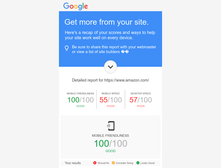
Feeling brave? Test your site or page here and see how Google grades it! Like most of the world, I use Amazon.com but I actually dislike a lot about the layout and user experience on the site itself. So for fun, I ran the Google test on it on 01/26/17; despite my bias, I was surprised at some of the low scores. While Amazon is “mobile-friendly,” it has poor site speeds and fails to optimize images. It also doesn’t use browser caching and is using scripts that are slowing the site down. How does your site or landing page hold up to the test?

It’s All About Them: User Experience

User experience is about how the user perceives and interacts with the page. If you look for the definition, you’ll see that there isn’t one simple, defined answer. You should really think about it in terms of a few questions. Is the landing page or website easy to use? Does the page or site valuable to the user? Is it frustrating to the user in any way? User Testing gives an extensive guide to the questions you should be answering when assessing user experience.

User Experience Landing Page Checklist:

Your landing page won’t make the experience cut without these vital pieces.
  • The most important information should be above the fold, where the user doesn’t need to scroll to see it.
  • Key information such as logo, phone number, address, contact form, etc. should typically be in the page header or at the top of the page.
  • The nature of the product or service and clear and compelling calls to action should be prominent, but not disruptive, and you guessed it, above the fold!
  • The page should be easy to navigate, and users should be able to achieve what they want in as few clicks as possible.
  • We all want instant gratification, so your page load time better be up to par; pages should load within one to two seconds.
  • The look, feel, and color palette should be consistent with that of the brand. Don’t create a landing page identity crisis!

Where’s My Bodyguard: Security

Last but certainly not least is security. It is best to ensure your pages are secure, and a must for eCommerce shopping carts. Google is turning up the heat, as always is putting special emphasis on this in Chrome, so it is important to address such issues now rather than later. Now is the time to take 30 minutes and get up to speed on the importance of SSL here. In addition to SSL, any other security badges like Google Trusted Store or Shopify Secure, add to the trust and safety you can provide. While multiple badges can become overwhelming or worse yet, desensitizing, site security badges from trusted partners can be worth displaying.

Calling In For Backup: Additional Resources
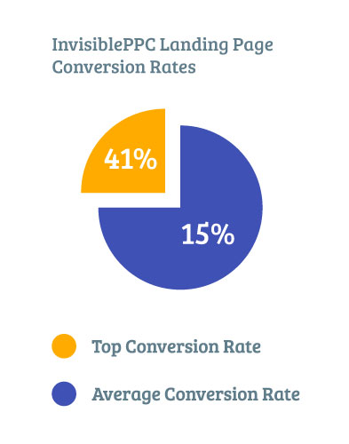
Landing pages and websites will never be perfect. It is kind of like owning a house. There will always be a way to redecorate. Someone will always look at it and have a different opinion or experience, and it is always a work in progress. The most important thing to remember is that you never have a second chance to make a first conversion, so do your best to avoid having your guests bounce out the door as soon as they arrive! As you can see, there is a science to building good landing pages, and Invisible PPC is the scientist. Our PPC landing pages average a conversion rate of about 15%, with our best performers as high as 41%! Try out one of our landing pages today!
See these additional resources:

Leave a Comment

Leave a Comment

Picture of Justin Rondeau
Justin Rondeau
Justin has been doing this whole “Marketing” thing since 2010, when he was mildly […okay maybe more than mildly] obsessed with all things, data, email, optimization, and split testing. He’s trained thousands of marketers, spoken on hundreds of stages, runs a delightful team of marketers, has dozens of shirts louder than his voice, and loves one hockey team: the Boston Bruins.